
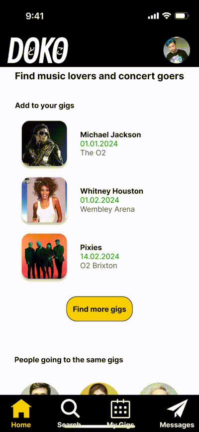
Is a mobile app designed for music lovers who enjoy live concerts but often attend alone. The app helps users discover fellow fans with similar tastes and make meaningful connections before, during, and after the show.
“Doko” means “where” in Japanese — but can also mean “accompany” when pronounced “Do-ko.”
UX/UI Case Study | Nov 2023 – Jan 2024
Role: UX Researcher, UI Designer
Tools: Figma, Maze, Google Forms
Objective
Help solo concertgoers find music-loving friends and make attending gigs more social and enjoyable.
User Insights
- Many users were enthusiastic about gigs, but avoided going alone
- Avoided niche shows if friends didn’t share taste
- Desired to connect with people attending the same events
“I’m not brave enough to go solo.” — Jess, 40, London
Research Process
Methods: Interviews, surveys, affinity mapping, personas, feature prioritization
- Connect with users going to the same gig
- In-app messaging
- Playlist and event sharing
Usability Testing (Maze)
Tasks:
- Sign up
- Add a gig
- Message another goer
Key Findings:
- Users wanted gig-specific connections first
- Location indicators were unclear
- Many tried to tap logo to return home
Iterative Improvements
- Reordered homepage to prioritize relevant users
- Added location indicators
- Enhanced logo tap + icon clarity
Final UI Highlights
- Friendly visual tone
- Responsive cards/buttons
- Smooth flows (Figma)
- Branding: “Doko” = Where/Accompany
Outcome
Final version made solo-going more social and safe by showing similar fans first. Navigation and features were iterated with real feedback.
Takeaways
- Visual polish isn’t enough—user flow > all
- Real-world feedback is gold
- UX/UI bridge is where I thrive
